✱ iPhone X: Why "The Notch" Exists

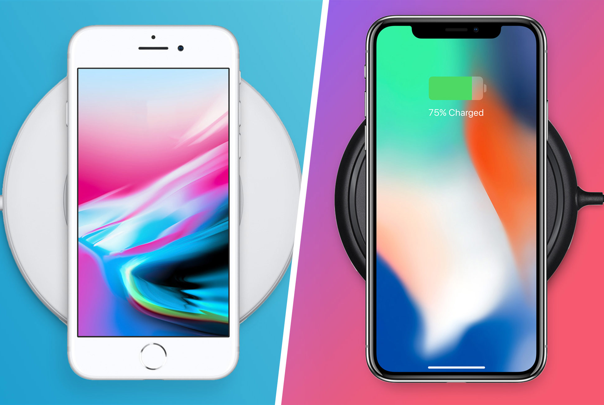
For all the complaints I've heard about "the notch" at the top of the iPhone X screen, I have a thought about why it exists. And yes, there are many ways my premise could have been handled, no doubt. But I think it was an intentional design decision. It's there to let you know where the "top" of the device is. It's otherwise a perfectly symmetrical design from the front. How else to you let your customers know how to orient the device when it's a perfectly smooth slab of glass? Like I said, I'm sure there are other ways but this one makes sense in this context.

We all know where our current iPhone bottom is based on the location of the home button. When you take that button away, users still need to know where the microphones and speakers are, otherwise there would be tons of complaints about not being able to discern the correct way to hold the phone (cue: "You're holding it wrong."). So now, instead of telling us visually where the bottom is, they're telling us visually where the top is.
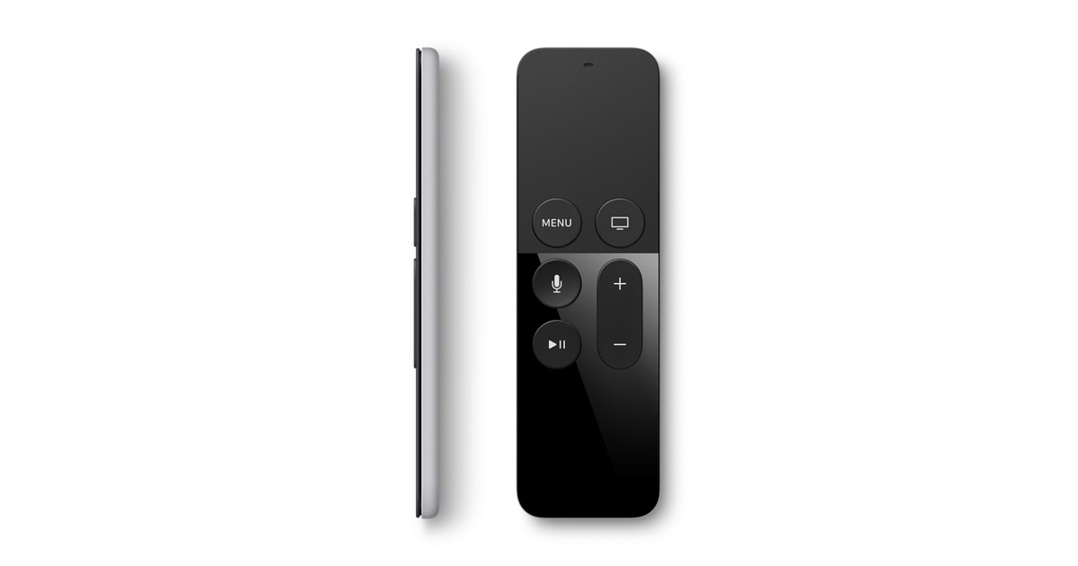
Just look at the AppleTV Siri Remote complaints for a case study. There have been so many complaints of the remote being symmetrical visually.


