✱ The Architecture of John Lautner
One of the benefits of living in Los Angeles is that there is great architecture to experience if you are willing to go out and visit it. I had the opportunity in late July 2011 to visit four homes by the late John Lautner who would be turning 100 years old. In celebration of that event, the MAK Center and the John Lautner Foundation cooperatively put on a home tour. I was happy to support these two entities and visit the homes of an architect whom I greatly admire. Lautner is by far one of my highest regarded icons of the profession. He was an undisputed master of linking spaces through form and structure.
The four homes on the tour, in the order I visited them, were the Sheats/Goldstein House (1963, remodeled in 1980), the Schwimmer House (1982), the Harpel House (1956), and the Jacobsen House (1947). They span a majority of his work, representing many stages in his career. Lautner had an immense vision for what architecture could be, and how it could be used to shape people's lives. Just as important to Lautner's vision were the clients that were willing to go along for the ride. Lucky for us, he had both.

The line between inside and out hardly exists, and at one time it didn't.
Cinema
Good architecture is cinematic. It evokes emotion. It happens in an instant - when the lighting in a space is perfect, the mood is right, the sounds in the room are exactly what they should be, drawing you in for a special treat. Just like the moment in a film that had been planned a year beforehand by the director and cinematographer - the lighting, environment, and everything else had to be just perfect before it was captured and printed on film. Then in post production, sound was added to create the most amazing quenching for the senses - visually, audibily, emotionally... and it becomes a spiritual moment. One that sits you down and makes you think about it. It makes you say 'whoa'. It actually moves you. You are affected by it, and you are glad you were there to experience it.
This is what architecture should be. It should be like cinema.

But does it float?
To me, Lautner was the Santiago Calatrava of today. He used amazing skeletal structures to encompass space. Like Rudolph Schindler, he understood that at the most basic level, his architecture was about the people who actually lived in his creations. He did the opposite of what so many architects do today - he designed from the inside out. In fact, this was the most prevalent experience I had on the tour. I was keenly aware that the architecture was responding to me. Lautner was able, on many levels, to make me experience my surroundings in a heightened way. I respect this about him. I am a lover of nature, and I can tell he was too. Nature plays such an important role in his architecture that often the lines between inside and outside are blurred if not nonexistent.
The homes we visited were designed for people to live in them, unlike today where the majority of homes are designed for just anybody. By that, I mean that they were designed to fit the owners like a glove - they were not designed in a vacuum for just anybody. Today, we just move in, paint the walls and change some pieces of furniture. Our homes tell us how to live, which is a mostly introverted life. Differently, Lautner's homes were always linked to the outside, and more importantly, part of it in a fundamental way. They borrowed nature and made it part of the spaces, bringing it in. The spaces reflected the needs of the family that it was designed for. It was a more pleasant experience because the building wasn't just a dumb box. It helped them live better.
Rather that write about each home independently, there was one overarching concept I found unavoidable in all four, and I thought it would best to just focus on that for now.
Linking Spaces
Lautner was able to link spaces on three different levels. One of the reoccurring concepts I experienced was that there was often a roof form or volumetric idea that spanned several spaces typically lined up end to end. Schindler was a master at interlocking adjacent spaces and volumes with complicated geometry. Lautner's work is a bit different - usually linking several spaces within a common, sweeping form or volume.
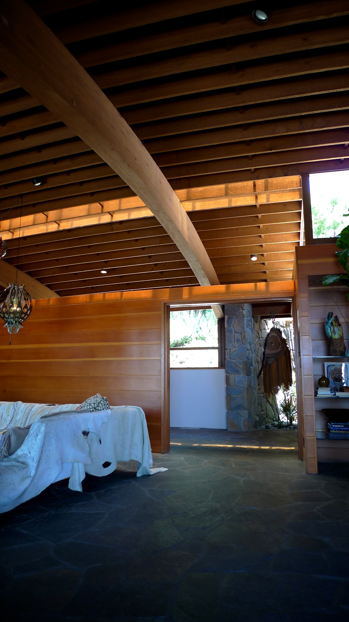
Usually the spaces of the homes were separated by partitions that didn't go up to the roof, but had glass so that noise wouldn't travel between them, while still maintaining a visual connection. There were several small and large spaces within a much larger space. This made the homes feel much larger then they were; more open and airy. They felt spacious, even though they were of a manageable size.

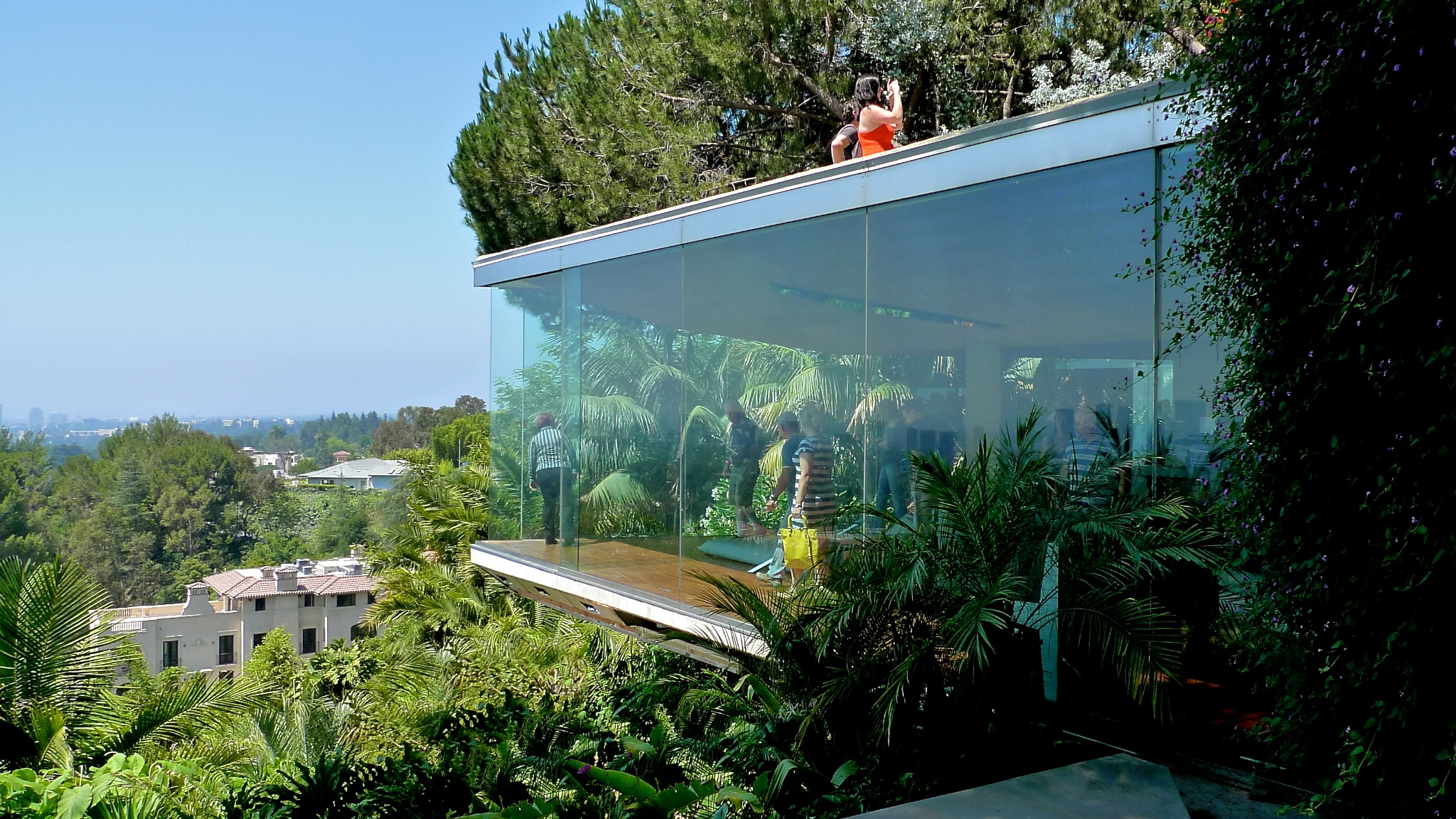
An example of a continuous roof form connecting multiple spaces
Second, Lautner linked the rooms of his homes to the immediate outside. Practically every room had a balcony, deck, or some personal outdoor space. Often times a corridor would run along the edge of multiple rooms that was completely outside, like you'd find at a motel. This forced the people who live there to experience their surroundings on a daily basis. This might sound like an odd way to live, but the owners of his homes wouldn't have had it any other way. Nature is an important ingredient to living. On top of that, there was usually at least one "wall" of each space that separated inside from outside only by a sheet of glass, as if the space was just an extension of the outdoors. He was a master of blurring this line.
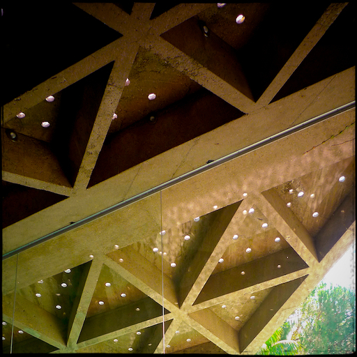
In the Sheats-Goldstein residence, where a thin glass plane now separates the living room from the outdoor pool deck (see the first picture) was once completely open. Lautner designed (invented?) an air curtain where a steady stream of air was forced out of the triangulated concrete roof form that cascaded down to the floor below. It's my understanding that this didn't last long as it didn't work perfectly (to say the least) and that Miss Sheats didn't like being in the living room as the rain came in sideways through the large opening.
Like Rudolph Schindler's sleeping baskets on top of the King's Road house, the idea was that Southern California's temperate climate afforded people the luxury (at least to them) of not having to enclose certain spaces. They cited the health benefits and pleasures of outdoor sleeping and living. Obviously this was before the major LA smog, and nowadays we lesser people must have our heat and air conditioning most of the time, but then things were a bit more rugged. This isn't meant to discredit the architectural ideals of Lautner and Schindler. In fact, I still believe in those ideals. I would love to have half of my house "outside".
The Sheats-Goldstein doesn't have air conditioning, is completely naturally ventilated with cross-breezes and operable roofs, and has radiant floor heating which even today would be considered a luxury. There are also over 750 small skylights that bring natural light into the living room along with sliding roof skylights over the kitchen and dining room. These things reinforce his ideals about linking spaces to the immediate outdoors.

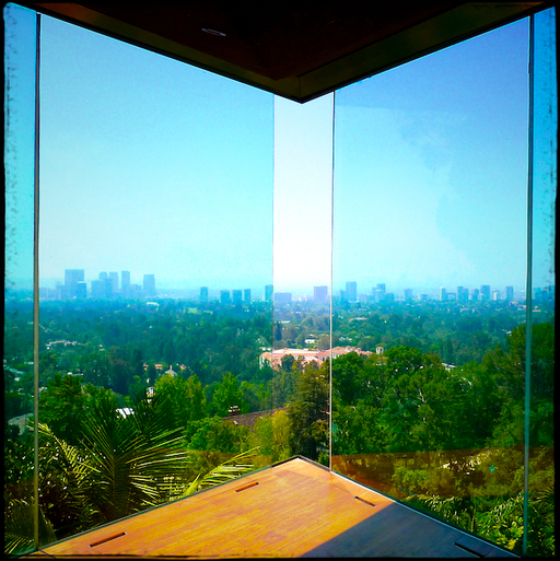
Linking indoors to outdoors was a priority for Lautner
Lastly, he linked these rooms and their personal outdoor spaces to their greater surroundings. This is a very strong connection. Almost every room has a view that has been framed in some way off to the distant city or landscape. He would even orient you so that as you were standing in a room, you were naturally and intentionally looking exactly where he wanted you to be looking so that you didn't miss the best views from the property. It is said that he preferred to look through the lens of a camera instead of using the typical architectural sketchbook for capturing moments while on early site visits. This perhaps explains why his spaces are so cinematic... framed just like a piece of art on a nonexistent wall.
There is so much more I could write about. It was a deeply meaningful experience and I want to be able to visit more of his buildings. As I do, I hope to understand more and more about what architecture really is all about.
Get Out
As designers, it is so important to go out and experience architecture. It can be difficult to pry yourself from the demands of the job, but it is such a worthy exercise. Too many designers are stuck in cubicles, removed and unplugged from the experiences of the people who actually end up using our buildings. I think it's impossible to design great architecture without experiencing it for yourself. We need to find out what makes great architecture affect its users. This was one of those opportunities for me. I hope you are able to get out and do it yourself. Stop making excuses and do it.
View a selection of my Lautner photo gallery.
Because of John's 100th birthday, there is quite a buzz online. Here are a few links to help satisfy your Lautner munchies:
- John Lautner Foundation
- MAK Center
- John Lautner on Wikipedia
Recent articles about John Lautner:
- An LA Story, by Alan Hess
- Lautner's Legacy, by Alan Hess
- Lautner's Houses in the Movies, Curbed LA
- Sheats/Goldstein House, Curbed LA
- Jacobsen House, Curbed LA
- Harpel House, Curbed LA
- Schwimmer House, Curbed LA
- Jim Goldstein - current owner of the Sheats/Goldstein House:
- Who the Hell is James Goldstein? Interview Mag
Books on John Lautner:
- The Architecture of John Lautner, by Alan Hess
- Between Heaven and Earthby Jean-Louis Cohen, Frank Escher and Nicholas Olsberg
- John Lautner, Architect, by Frank Escher
- Lautner, 1911-1994: Disappearing Space, by Barbara-Ann Campbell-Lange
Films about John Lautner's work:

